 PickVids
Best Graphic design & typography Videos
The 38 Graphic design & typography videos here were recommended by different people across different months. Choose by who it is for: 5 introductory, 2 intermediate, 29 for a general viewer, and 2 for someone who wants the harder derivation. Most of them are an explainer. What they share is that one picture or analogy is used to supply a missing concept. Channels you will keep seeing include Computerphile, Tom Scott, Technology Connections.

Brown; color is weird
Technology Connections explains why brown is not a spectral color but a context-dependent perception, essentially dark orange seen against brighter surroundings.

Stephen Fry Kinetic Typography - Language
A kinetic typography animation set to Stephen Fry's spoken essay on language.

FarewellEtaoinShrdlu
A documentary on the last day the New York Times was printed with linotype machines in 1978, following the process from the newsroom to the press.

How I Designed a Free Music Font for 5 Million Musicians (MuseScore 3.6)
Tantacrul explains how he and engraver Simon Smith designed the free music notation font for MuseScore 3.6.

Mouse Cursor History (and why I made my own)
Posy gives a short history of the computer mouse cursor, from early straight pointers to the tilted arrow, comparing Apple and Windows designs.

Uppestcase and Lowestcase Letters [advances in derp learning]
Tom Scott-style absurdist research by tom7 for SIGBOVIK 2021, using machine learning to discover letterforms that are 'uppercaser' than uppercase A and lowercaser than lowercase.
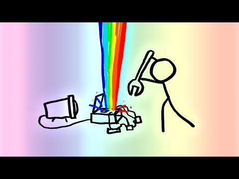
Computer Color is Broken
MinutePhysics explains that computers store brightness nonlinearly, so blurring and blending colors in raw RGB gives wrong, dark results.

Characters, Symbols and the Unicode Miracle - Computerphile
Tom Scott explains for Computerphile how Unicode and UTF-8 grew out of messy older character encodings to become the web's standard.

Plain Text - Dylan Beattie - NDC Copenhagen 2022
Dylan Beattie's conference talk explores the history and mess behind plain text: encodings, Unicode, line endings and the many ways text goes wrong.

A quick tour of TeXmacs
A four-minute tour of the TeXmacs scientific editor, showing math typing, figures, citations, a drawing tool, document styles, HTML export, presentations and animations.

Refterm v2 - Resource usage, binary splat, glyph sizing, and more
Casey Muratori follows up his refterm proof-of-concept, a GPU-based terminal renderer, with a second part covering memory usage, glyph sizing and correct Unicode and VT handling.

Microsoft Re-Designs the iPod Packaging
A 2006 parody made by a Microsoft team that shows how the company would redesign iPod packaging, with a box piled with feature claims, logos and clutter in contrast to Apple's clean design.

Thoth's Pill - an Animated History of Writing
NativLang's 47-minute animated documentary traces the birth and evolution of writing, from early cave marks to modern scripts.

Segmented Displays
Posy explores segmented displays, from the seven-segment display to alternative designs with fewer or more segments, with patents and history.

AT&T Archives: Saul Bass Pitch Video for Bell System Logo Redesign
The 1969 pitch film in which Saul Bass presents the Bell System logo redesign to AT&T, part of the largest corporate re-identity program in U.S.

WordTeX - A WYSIPCTWOTCG Typesetting Tool
Tom Wildenhain's SIGBOVIK 2018 presentation of WordTeX, a Microsoft Word template that mimics LaTeX typesetting output.

Badness 0 (Apostrophe‛s version)
Tom 7's pilot episode of a series that plays with type systems and absurd programming, presented as a parody of the GPL v3 license.
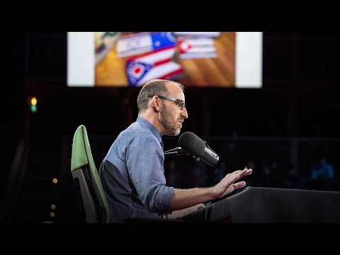
Why city flags may be the worst-designed thing you've never noticed | Roman Mars
Roman Mars gives a funny TED talk on vexillology, laying out five basic principles of good flag design and why many city flags fail them.

w
jan Misali traces the history of the letter W, including why it is called double u.

Steve Jobs Stanford Commencement Speech 2005 high definition.flv
Steve Jobs's 2005 Stanford commencement address, in which he tells three stories about connecting the dots, love and loss, and death, including his remarks on typography.

Pragmatic Unicode, or, How do I stop the pain?
Ned Batchelder's PyCon 2012 talk gives a quick overview of what Unicode is, then focuses on what a Python programmer needs to handle text correctly.

1993 interview re: Paul Rand and Steve Jobs
A 1993 interview in which Steve Jobs talks about designer Paul Rand, who created the NeXT logo.

Introducing SILE: A New Typesetting System
The SILE author's FOSDEM 2015 talk introducing SILE, a TeX-inspired typesetting system with frame-based layout, Unicode, OpenType and a Lua-based extensible design.

The Great 202 Jailbreak - Computerphile
Computerphile with Professor Brailsford on how a 1979 Bell Labs team reverse engineered a Linotron 202 phototypesetter over a summer to get high-quality print output.